Tuesday, March 28, 2017

Distance Azimuth Survey

Introduction
Figure 1. Measuring diameter of a tree
using a standard tape measure
The purpose of this lab was to explore different ways of surveying for when certain technology, such as a GPS device, may fail or be unavailable. Three different sites were surveyed, each using a different method. Each method involved measuring the diameter of the trees with a measuring tape (Fig. 1) and the latitude and longitude were measured from each focal point for spatial reference (Fig. 2). One method used a TruPulse laser that calculated the distance in meters as well as the azimuth in decimal degrees (Fig. 3). A second method used a regular compass for the azimuth and measuring tape for distance (Fig. 4 & 5). The third method required a device called "Sonin Combo Pro" (or rangefinder) (Fig. ) which sent a signal from the device at the focal point to a person holding another device next to the tree in order to measure the distance, and a compass. This data was considered to be implicit, which means it is all relative or approximate. Explicit data is exactly tied down to a geographic point.

Figure 2. GPS used to find longitude and
latitude at each focal point.
Figure 3. TruPulse laser device used to measure
distance and azimuth in the field
Figure 4. Normal compass for finding azimuth.


Figure 5. Excitedly using a measuring tape to measure distance
Methods
Study Area
Figure 6. Study Area in Putnam Park.
The three sites from which data points were collected were all located within Putnam Park on the UW-Eau Claire campus in Eau Claire, Wisconsin. Each location had snow cover as well as a number of red/white oaks of diameters ranging from 18cm to 86cm. The three sites were chosen to be spread apart from each other, but other than that, there were no criteria for site selection. Each focal point was chosen to be in the center of the woods rather than on the edge near the street so that the lasers could accurately reach the trees being measured (Fig. 6).

Data collection
Points were handwritten as they were measured in the field and later entered into an Excel spreadsheet and normalized (Fig. 7). The latitude and longitude where measured at the focal point of each study sight using a GPS device. The distance (from focal point to tree) was measured in meters, azimuth was measured in decimal degrees, and diameter of each tree was measured in centimeters.
Figure 7. Sample of data in Excel spreadsheet after normalization

Map Creation
Figure 8. Results after using
"Bearing Distance to Line command"
Figure 9. Results after using "Feature
Vertices to Points command"
Before the data could be brought into ArcMap, it needed to be normalized. This was done by taking the latitude and longitude values and dividing the minutes by 60. The data table was then brought into ArcMap using a tool called "Bearing Distance to Line Command" which is found in the toolbox under Data Management and the Features. This created a series of lines outward from the focal point (Fig. 8). Next, a tool called "Feature Vertices to Points Command" was used to turn each of the trees into points on the map (Fig. 9). This tool is found under the same category as the first tool, and what it does is it creates a feature class points from vertices of the input features. After this, basic mapmaking techniques were used to create a study area map (Fig. 10) and individual maps of each study site (Fig. 11).

Figure 10. Final map of study area including all three sites with tree locations at appropriate azimuths and distances.

Figure 11. Individual study sites using three different survey methods. Site 1: TruPulse device. Site 2: Compass and measuring tape. Site 3: Sonin Combo Pro device.
Results/Conclusions
This lab provided three new techniques for surveying which do not rely on heavy technology. This is very useful for varying conditions as the outdoors can be very unpredictable in terms of weather. It is also helpful because sometimes time or money restrictions do not allow for expensive gear or repairing broken gear. It is very important to have a back-up plan when doing field surveying so that the job can still be done under any circumstances. Each of these methods seemed reliable enough, however the basic measuring of each element with an old school device such as compass and measuring tape always seems to be the most reliable technique because there is no allowance for technological glitch. It seems that drone surveying has replaced this type of surveying because it is just so much faster and easier and can include tons of data in just one field survey.


Tuesday, March 14, 2017

Processing UAS Imagery with Pix4D

Introduction
Overview of Pix4D software
The objective in this lab was to get acquainted with using Pix4D software package to process imagery. An Unmanned Aerial System (UAS) was used to collect the imagery provided for processing in Pix4D.

What is the overlap needed for Pix4D to process imagery? What if the user is flying over sand/snow, or uniform fields? For a general case, at least 75% frontal overlap (with respect to flight direction) and 60% side overlap (between flying tracks) is needed. If flying over sand/snow, or uniform fields then at least 85% frontal overlap and 70% side overlap are necessary.

What is Rapid Check? Rapid check is a function that speeds up processing by lowering the resolution of the original images. It is recommended for use in the field because it is much quicker than full processing.

Can Pix4D process multiple flights? What does the pilot need to maintain if so? Yes, the pilot needs to maintain 3 things: 1. each plan captures the images with enough overlap, 2. there is enough overlap between 2 image acquisition plans, and 3. the different plans are taken as much as possible under the same conditions (sun, weather, new construction, etc.)

Can Pix4D process oblique images? What type of data do you need if so? Yes, it can process oblique images as long as the user knows what angle off nadir the images were collected.

Are GCPs necessary for Pix4D? When are they highly recommended? GCP's are not necessary, but they provide information on scale, orientation, and absolute position, so they are highly recommended when working with images which don't have any geolocation.

What is the quality report? The quality report basically provides all of the metadata and allows the user to see if there are any errors to take note of before moving forward.

(Answers provided by Pix4D Software Manual)

Methods
Walkthrough of Pix4D software
Step 1: Open the Pix4D Mapper software and create a new project. When naming the project, it is important to include the date, site, platform or sensor, and altitude. The name for this project was 20160621_litchts_phantom3_60m ("ts" was added to identify the creator's initials).

Step 2: Select images to add. All of the imagery needed for this project was located inside a folder, so the "add directories" function was used to add all images at once. Pix4D will then read the metadata associated with the imagery and note if they are geotagged as well as indicating the coordinate system used. Camera properties are also included but are often unreliable and will need to be edited. Change the camera model to Linear Rolling Shutter. Parameters should then look like Fig. 1.
Figure 1. Camera parameters as viewed in Pix4D.

Step 3: Leave the coordinate system in default, it should be WGS84/UTM zone 15N. Next, choose the 3D maps processing template. Now the set-up is complete and processing can begin.


Figure 2. Prior to beginning steps 2 and 3 (Note: step 1 is
UNCHECKED!)
Step 4: Now a map of the flight path is showing. Uncheck steps 2 and 3 at the bottom and then open processing options. In the DSM and Orthomosaic tab, change the raster DSM method to Triangulation for the best results. Then you can run the Initial Processing. Once that is finished (it will be awhile), uncheck step one and re-check steps 2 and 3 and click start (Fig. 2).

Summary of quality report: 100% of the images were used (68 total), none were rejected. Georeferencing was used however there were no 3D GCP's. Most of the area had very good overlap (Fig. 3), the only areas with low overlap were the left and bottom edges. This may be due to lack of full coverage from some images but this is a very minor detail.
Figure 3. Shows overlap of imagery used in Pix4D. Green areas have high overlap which is good, yellow/red areas have poor overlap.

Results

Here is an animation fly-over created in Pix4D as well as a map of the Litchfield mine created in ArcMap using the raster datasets created in Pix4D.
Figure 4. Map of Litchfield Mine created in ArcMap.

Conclusion

Final Overview of Pix4D software
Pix4D software is very user friendly for those who have had an intermediate amount of GIS training. It makes turning imagery into a real map with metadata much easier than old school processes. Through this lab, a new understanding of aerial imagery was gained after seeing all of the metadata that goes into creating maps. Using Pix4D in this activity was solid preparation for future field surveying with drones and transforming imagery.

References
https://support.pix4d.com/hc/en-us/articles/204272989-Offline-Getting-Started-and-Manual-pdf-#gsc.tab=0
http://hagenfieldmethods.blogspot.com/2016/05/processing-uas-data-in-pix4d.html

Tuesday, March 7, 2017

Using Survey123

Introduction
The intention of this lab was to get acquainted with ESRI's "Survey123", an app for gathering survey-based field data. An online tutorial from the ESRI website uses data collection to help a homeowner's association develop tools to be more prepared for natural disasters and their repercussions. The objective is to build skills in these areas: creating a survey with Survey123, submitting a survey with a URL link in a web browser as well as in the Survery123 field app, analyzing survey results in the Survey123 website, and sharing survey results with other ArcGIS platform client apps. (Objectives directly from ESRI lesson site).
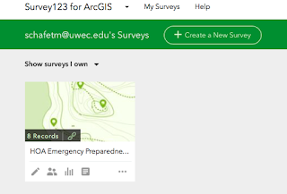
  Figure 1. My first survey on Survey123

Methods
Lesson One: Create a survey
First, I logged into the Survey123 website using my enterprise account through UWEC. Next I created new survey through the website server, and added a few simple questions to the survey like participant name, location with an interactive map, and date of survey submission. I learned how to add simple questions like fill in blank, single choice, and multiple choice and how to make them mandatory with a red asterisk. Next I learned how to set a dependency so that certain questions will appear based on answers to previous questions. For example, if one answers "yes" to a question, a certain question will pop up and if one answers "no" to the same question, the secondary question will not appear. Next I added 9 yes/no questions pertaining to the 9 "fix it" safety questions developed by an HOA (homeowner's association) for earthquake and fire preparedness and named it the HOA Emergency Preparedness Survey (Fig. 1).

Lesson Two: Complete and submit the survey
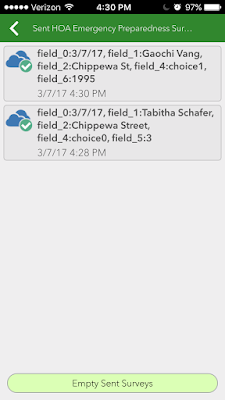
For part two, I viewed and took the survey from both a web browser and a smart phone via the Survey123 app (Fig. 1). I collected a sample of data by submitting the field survey a number of times with varying answers. I explored the app to take a look at all of the functions, such as the "submit later"  and "empty sent surveys" functions (Fig. 3).
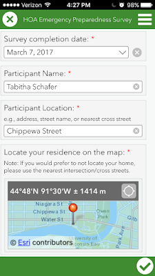
Figure 2. Inside the HOA Emergency Preparedness
Survey on a smartphone
Figure 3. Submitted surveys in the Survey123 app.
Note the option to empty sent surveys.


Lesson Three: Analyze survey data
Figure 4. Survey data viewed as a heat map to show
where most of surveys were taken
To analyze the data, I viewed an overview page on the Survey123 website which showed: total number of surveys submitted, total number of participants (based on accounts), and the dates of first and last surveys submitted (Fig. 5). I learned that many results can be viewed as a bar graph, pie charts, percentages, or points on a map. Numeric questions provide statistics like min/max, average, and sum. I learned how to analyze individual survey responses and use filters to select what data I want to show/include during analyzation. Survey data can be exported as a .csv, shapefile, or file geodatabase, and can also be viewed in ArcGIS Map viewer to see where the most surveys are being taken (Fig. 4).

Lesson Four: Sharing survey data
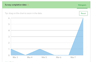
Figure 5. A graph showing the dates of each survey taken
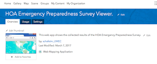
In part 4 I learned how to configure pop-ups on a web map to show information from each survey when you click on point on map (Fig. 6). I also learned how to save a web map with a description and tags so that others can find it. I then created a web app through which other HOA members can access my survey results (Fig. 7).
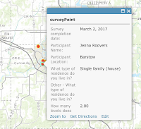
Figure 6. An example of a pop-up on the web map

Figure 7. The completed web app for the HOA Emergency
 Preparedness Survey Viewer


Results
Most of the surveys were taken on March 7th. 3 out of the 8 participants were located on Chippewa St. in Eau Claire WI, and only one of the 8 participants was located outside of Eau Claire. 62% of surveyors came from Single family homes while the other 38% came from multi-family residencies. Of those in single-family homes, the average number of levels was 2.6, and the average number of people (among all types of residency) was 4.75. Every household contained at least one person between the ages of 18 and 60 years old, while only 12% of homes contained a child of 0 to 5 years of age. Pads and velcro were found to be the most common modes of securing computers, while straps were most common for televisions. 75% of participants admitted to having objects on the walls above their beds. 75% of homes were found to have at least one fire extinguisher. The most common emergency object found in these 8 households was a first-aid kit.

Link to web app: https://uwec.maps.arcgis.com/home/item.html?id=e0f790f2fc38490fb550c9417943e5d0

Conclusions
Survey123 makes it very easy for anyone to turn qualitative data into quantitative data and then project it onto a map. It is so easy to use and understand and I plan on using it very much in further field studies because it keeps everything in one place and allows a very simple transformation of data. It also allows for the sharing of collected data via web map and web app, which is vital because why else would we do this research if not to share our findings? On top of that, the accessibility of the Survey123 app on not only any web browser, but also a smartphone or tablet, makes this app very appealing to someone with a lot of field research in their future.

Developing a Field Navigation Map

Objective
The goal for this lab was to create a cartographically pleasing navigation map to be used for a future project at the Priory, a parcel of land owned by UW-Eau Claire.

Introduction
Navigation maps require a different set of characteristics than a normal map. Since they are used for finding one's way around, a location system of some sort is necessary such as a coordinate system and a projection. A coordinate system assigns a system of numbers used to define locations in the field, and a projection takes longitude and latitude and converts them into an XY coordinate system. In this lab, the Universal Transverse Mercator (UTM) coordinate system was used for one map (Fig. 2), and a Geographic Coordinate System (GCS) was used for another map (Fig. 3) so that the two could be compared in terms of which one is most useful and easy to understand.

Methods
This lab involved two parts: finding a personal pace count and the creation of the navigation maps.
Part 1: Pace Counting
To determine a personal pace count, a distance of 100 meters was measured out and each person counted the steps they took with their right foot along this distance (Fig. 1). (My personal pace count is 63 steps per 100 meters). This was repeated twice for accuracy.
Figure 1. Study Area for pace counting.


Part 2: Developing the navigation maps
Two maps were created for part 2: one containing a UTM grid at 50 meter spacing, and the other providing Geographic Coordinates in Decimal Degrees. The data used to create these maps was provided by the UWEC Geography Dept. The first step was to import the basemap containing aerial imagery of the study area into ArcMap. The the study area was identified by a layer provided by the UWEC Geography Dept. showing the boundaries of the Priory. A contour layer showing elevation in 5 meter increments was added as well because elevation is important in navigation. The contour layer was clipped to show contour lines only inside the study area to make the map look more neat. The aerial basemap was reduced to a 30% transparency for cartographic reasons as well. Then, in order to make sure all of the layers were in the NAD_1983_UTM_Zone_15N coordinate system with the Transverse Mercator projection, each layer had to be reprojected using the project raster tool. To add the grid system to the map, a new grid was created in the data frame properties. For this UTM map the grid was a measured grid with 50 meter spacing (Fig. 2)

For the GCS map, the basemap imagery, elevation contours, and study area layers were all reprojected into the GCS_North_American_1983 coordinate system and the measured grid was removed and a graticule grid was added with decimal degrees showing 4 decimal places (Fig. 3).


Results
Figure 2. UTM navigation map of the Priory with a 50 meter interval grid and 5 meter elevation contours.
Figure 3. GCS map with decimal degrees and 5 meter elevation contours.
Conclusion
The UTM map is a little bit less cluttered because the intervals of the grid are larger, however this causes a lack of precision when navigating. Both maps are good for different purposes. The GCS map allows for closer navigation while the UTM map is better for approximation and less detailed surveying. The UTM map is also easier to understand for someone who does not have a lot of navigation experience because it is measured in meters, while decimal degrees may not mean a whole lot to someone who has never learned how to reference them.