Tuesday, February 21, 2017

Cartographic Fundamentals

In this lab, the fundamental requirements of mapmaking are explored and explained. There are a few essentials one must include in a map in order to make it decipherable. Elements such as the north arrow, scale bar, title, watermark, locator map, and legend are very important for understanding what the map is portraying, but metadata is also as important. Each of the following maps includes the necessary elements as well as the data and metadata explaining how the maps became what they are.

Part One: Creating a map
To create a map of the sandbox terrain, coordinate points were collected by creating a grid with string and tacks and then measuring elevation with a meter stick (see Sandbox Survey I and II for details). The map shown below (Fig. 1) features an aerial view of a hillshade display which adds shadows from taking into account the sun's relative position. It also features the terrain from four different oblique angles to show the geographical features at different viewpoints. The mean depth was -2.7 cm, and the minimum was - 13.5 cm, and the maximum was 4.9 cm.
Figure 1. The Sandbox Survey from 5 different views. Left: aerial view with hill shade effect. Scale bar represents length of sandbox, north arrow indicates true north. Depth is measured in centimeters, with negative values being below sea level and positive values above sea level. Top Right: oblique view from northwest corner. Second Down on Right: oblique view from northeast corner. Third down on Right: oblique view from southeast corner. Bottom Right: oblique view from southwest corner. 
The ridge can be found in the western area, it is the blue ovular shape. The hill is also blue and can be found in the northeast corner of the map. The depression is the round, yellow and orange and pink area near the hill in the northeast part of the map. The valley is the long yellow region in the southern portion of the map. The plain is the large pink area that stretches across the middle of the map.

Part Two: Creating a map using data with Attributes
To create maps using data with attributes, data provided by the UWEC Geography Dept was brought into ArcMap. The data used was collected from Hadleyville cemetery in Eleva, Wisconsin on September 14th, 2016 using a DJI Phantom quadcopter at 50 meters high. The data was used to create four maps, each of which displays a different attribute for the cemetery. Each map used the WGS 1984 projection.

A nominal map labeling the YOD for each grave
Figure 2. A map representing each grave at Hadleyville cemetery with the year of death labeled. Graves are represent by a grey triangle. Graves without a date next to them are unknown. A locator map indicates where the cemetery is found in Wisconsin. 
To create this map (Fig. 2), the labels were turned on and set to "YOD" so that the year of death would be shown next to each grave. The font color was set to white to make it easily seen. The north arrow was inserted, and a scale bar set to meters. A locator map of the state of Wisconsin was provided including Eau Claire County and a symbol where Hadleyville Cemetery is located within. The scale for the locator map was also set to meters to maintain homogeneity.

A nominal map providing the last name on the grave
Figure 3. A map showing the Hadleyville cemetery with last names labeled next to graves. Graves are represented by grey triangles. A locator map indicates where this cemetery is found in Wisconsin.
To create this map (Fig. 3), the "YOD" label setting was changed to "Last_Name". It shows the last name of the deceased next to each grave. Everything else on the map was kept constant with the first map (Fig. 2).

A nominal map that has color coding for if a grave is standing or not
Figure 4. A map showing whether each grave is standing, not standing, or unknown. A locator map indicates where this cemetery is found in Wisconsin.
To create this map (Fig. 4), the labels were removed and the symbology for the Graves feature class was changed to Unique Values based on the Standing attribute field. This provided a different color for each of 3 categories: standing, not standing, and unknown. The locator map, north arrow, and scale were all kept constant with previous maps (Fig. 2 and 3).

A numeric ranking map that has different sizes of points related to the YOD
Figure 5. A map representing each grave by year of death. Older graves have smaller symbols. A locator map indicates where this cemetery is found in Wisconsin.
This map (Fig. 5) was created by changing the symbology to Quantities > graduated symbols, so that symbols increased in size as the year of death got closer to the present time. They were split into 5 classes. Once again, the locator map, scale bars, and north arrow were all kept constant.

*Note: Statistical metadata is missing for these maps because they are not raster files

The goal of this lab was to incorporate all of the fundamental elements of a map and portray proper usage of those elements. They include the north arrow, legend, scale bar, title, locator map, and watermark. Without all of these elements, the document is not considered a map, so it is vital that these not be forgotten when creating a map.

Monday, February 13, 2017

Sandbox Survey II: Interpolating Data in ArcMap

Introduction 
In Sandbox Survey I, x, y, and z coordinates were collected from a man-made terrain in a sandbox plot (Fig. 1). The purpose was to utilize one of the sampling techniques for large areas to collect data. Data Normalization is adjusting values to a common scale so that they can be worked with. The data points collected from the sandbox survey needed to be normalized in order to show realistic differences in depth and to be interpolated into ArcGIS for further analysis. 
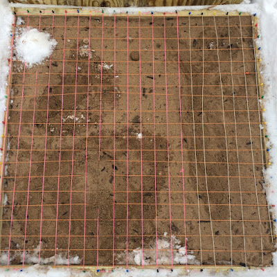
Figure 1. The sandbox plot with coordinate grid and man-made terrain. 
 
Interpolation is the method of estimating cell values in a raster by using limited sample data points. There were 213 data points provided, and once normalized, they provide information describing the depth of the terrain in each subset, and the interpolation procedure used helps to fill in the "holes" where data was not collected for the sample survey. 

Methods 
For organizational purposes, a new geodatabase was created as a place to keep all of the raster files interpolated into ArcMap. After the data containing the Z values was normalized in Excel, it was imported as an XY data table in ArcCatalog. It was then brought into ArcMap as a point feature class, exported as a layer file, and added to the geodatabase in order to be opened in ArcScene (Fig. 2). When data is brought into ArcMap like this, it is important to export it as a layer file so that it is permanent and can be worked with. The point feature class "brought the data to life" and was then ready to be turned into a continuous surface using the various interpolation techniques described below.
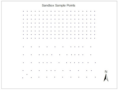
Figure 2. XYZ sample points represented as a points feature class in ArcMap
IDW: Inverse Distance Weighted interpolation determines cell values by assuming that points which are close to each other are more alike than they are with points further away from them. It gives greater weight to the sample points surrounding the cell and less weight to the sample points further from the cell.  The advantage of this method is that it is usually quite accurate. The disadvantage, however, is that it cannot generate estimated points higher than the highest sample point or lower than the lowest sample point, so random sampling makes it easy for this method to become inaccurate. (ArcGIS Help)

Natural Neighbors: this method applies weights to the nearest subset of sample points based on their proportionate areas. It is different from the IDW method because it only uses a subset of surrounding points, instead of using all of the sample points. A pro for this method is that it works well with both regularly distributed data as well as irregularly distributed data, but a con is that like the IDW method, it cannot generate estimated points beyond the range of the sampled points. (ArcGIS Help)

Kriging: creates a surface based on spatial arrangement of surrounding values or using mathematical formulas to determine statistical relationships between measured points. The mathematical formulas help to eliminate inaccuracies, however it is difficult to know which formula would work best for the data at hand without prior knowledge of complex math and statistics. (ArcGIS Help)

Spline: creates a smooth surface passing through all measured points using a mathematical function to estimate missing values. This method is able to observe trends and create highs and lows that may not have been actually sampled, but if values are close together but have drastically differing values, this method struggles. (ArcGIS Help)

TIN: this method uses a tool which turns raster points into a Triangular Irregular Network. The edges of these triangles capture the position of things like ridge lines or streams. TIN works best for data sets with a high sample size in areas with large variation in elevation. This method can estimate pretty much any unknown point, however it is known to be the least reliable of these 5 interpolation methods.

The 3D scene images of each interpolation method were exported as jpegs in order to be used in a map layout. This made the images easily transferrable into ArcMap to compare next to the 2D images. The orientation of the 2D images was decided to be the same orientation of the photo of the sandbox plot in Sandbox Survey I to prevent confusion (Fig. 1) The orientation of the 3D images was the same as that of the 2D images for proper comparison. A scale bar was used to ensure that each map is in the same scale and therefore can easily be compared with each other. Scale and orientation are important for interpreting such maps because the disproportion of the 3D maps may cause the 2D maps to appear larger or smaller than they truly are. 

Results & Discussion
The IDW interpolation method produced an average-looking representation of the sandbox terrain (Fig. 3). The surface appeared very bumpy, however it did represent each of the points that were sampled. Each of the man-made geographical features is visible in this map, however the ridge and the hill appear to have points when in reality they should be smooth. The flat plain is represented smoothly here.
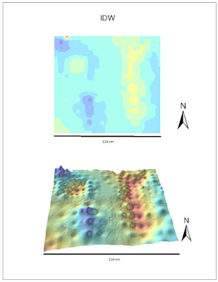
Figure 3. IDW interpolation method. Top map shows the 2D depiction of sandbox plot, bottom map shows 3D depiction. Scale bar on bottom represents length of plot.
The Natural Neighbors interpolation method still showed peaks in the ridge that should not be there, however the depression and the valley are both very well done (Fig. 4). There are also some bumps that should be smoothed out, but overall this method seems to be very good at distinguishing depth and filling in the spaces.
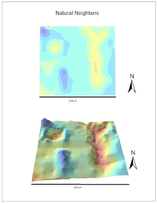
Figure 4. Natural Neighbors interpolation method. Top map shows the 2D depiction of sandbox plot, bottom map shows 3D depiction. Scale bar on bottom represents length of plot. 
The Kriging interpolation technique did not provide an attractive model( Fig. 5). The 2D model provided a good representation of depth using the symbology, however the 3D model did not represent depth well at all. It was very jagged looking and the geographical features hardly had a difference in depths at all.
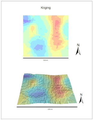
Figure 5. Kriging interpolation method. Top map shows the 2D depiction of sandbox plot, bottom map shows 3D depiction. Scale bar on bottom represents length of plot.
The Spline interpolation method was the best option for this data set. It created a very smooth surface and the hill, depression, ridge, plain, and valley were all distinguishable. The shadow effect helped to show edges that are not visible in the 2D image. Although it still does not look perfect, the spline interpolation method appears to best represent the data at hand.
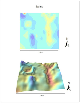
Figure 6. Spline interpolation method. Top map shows the 2D depiction of sandbox plot, bottom map shows 3D depiction. Scale bar on bottom represents length of plot.
 The TIN interpolation method successfully showed each of the geographical features, however there was no smoothness to the image (Fig. 7). This method does a very good job with depth and creating a general depiction of the landscape, but it is not a good representation of the true terrain.
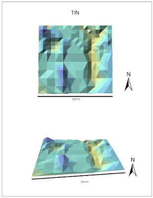
Figure 7. TIN interpolation method. Top map shows the 2D depiction of sandbox plot, bottom map shows 3D depiction. Scale bar on bottom represents length of plot.

Each of these interpolation methods provided a 3D image of the sandbox plot containing a ridge, valley, plain, depression, and hill. This shows that enough data points were sampled to ensure that each land feature was recognized and the "gaps" were able to be filled in. If this lab were to be repeated, it could be said that even less sample points might be taken because these interpolation tools do a very good job of estimating landscape and depth. The accuracy of these techniques, however, is dependent on the sample data and it is important to have a solid sampling strategy from the start.

Summary & Conclusions 
This survey is similar to other field based surveys because it requires strategic sampling of measured values from a large area. The concept is the same in that a limited amount of data is used to represent a larger area. However, it is different because in this field survey the values were measured by human instead of a computer or device of some sort, so there is much room for human error. It is not always realistic to perform a detailed grid-based survey because there are limitations on time, money, equipment, weather, and workers. All of these factors play a heavy role in determining the type of field survey to be used. Interpolation methods can be used for continuous data or things that are generally spatially-based. This includes things like temperature, rainfall, chemical composition, noise level, and others. 

Resources
ArcHelp desktop
Previous GIS student blogs (Paul Cooper and Rachel Hopps)
Esri Help

http://planet.botany.uwc.ac.za/nisl/GIS/spatial/chap_1_11.htm

Tuesday, February 7, 2017

Sandbox Survey I: Understanding Coordinates and Grids

Introduction
Sampling is a method of investigation of a large area (or population) by gathering data from a small portion of the whole to make estimates about the whole. Spatial sampling techniques involve 3 types: Random, Systematic, and Stratified.
  1. Random sampling is the least biased, however it is also the least reliable in terms of representation, because it is hard to know if the points are evenly distributed and/or hit each big area. 
  2. Systematic sampling is where there is a planned pattern of which data points will be collected. It is more reliable than random sampling but has potential to be more biased. S
  3. Stratified sampling is where the larger group is divided into subsets and then data points are systematically gathered.
Each technique can be used with points, lines, or area. The objective of this lab was to perform a terrain analysis utilizing one of the three sampling techniques mentioned above as well as an established coordinate system.
Methods
  • Technique: The sampling technique used in this project is stratified sampling. This method was chosen because it allowed for more data points to be collected where necessary. It also allowed for the whole area to be broken up and appropriately analyzed. It is similar to the systematic sampling because there was a pattern used. In the bottom half of the sandbox, the there was not a lot of changing terrain so every other point was collected in alternating rows. Systematic sampling was not used because it does not allow for collecting more points in certain subsets the way stratified sampling does.
  • Location: The sample plot is located in Eau Claire, Wisconsin on the UWEC campus. More specifically, in a sandbox by the biology shed to the left of Phillips Science Hall. 
  • Materials: The materials used were: sandbox plot, sand, snow, tacks, string, meter stick, pen, and paper.
  • Setup: The plot was 114 cm x 114 cm, so it was divided into a grid of 19x19 (each square being 6 cm by 6 cm) using tacks, string, and meter stick.
  • Zero elevation: sea level was determined to be level with the sandbox because it is solid and cannot be moved with the weather as the sand/snow could.
  • Data collection and  entry: due to cold weather, it was not feasible to enter data into a computer as it was collected. Data was handwritten into a pre-made data table and later entered into Microsoft Excel to be shared and stored. X, y, and z planes were measured using the meter stick and rounded to the nearest 1/2 centimeter. 

Figure 1. Collecting data points with the meter stick

Figure 2. The sandbox plot with coordinate grid including a ridge, hill, depression, valley, and plain.

Results and Discussion
A total of 213 data points were recorded. The minimum value for depth was -8cm, and the maximum value was +5cm. The mean depth was -2.7cm. The sampling method seemed to work well and ample data points were collected. However, systematic sampling could have provided for less risk of bias. The sampling method was decided before data collection began and was not changed throughout, however, as terrain became more diverse on the north end of the plot, it was decided that it was necessary to begin collecting more data points to accurately account for more drastic elevation changes. A few problems that were encountered were loose strings resulting in slightly uneven grid squares, but these were easily fixed by tightening the strings and adjusting the tacks holding them in place.

Conclusion
The technique used in this project demonstrates the definition of sampling because points from smaller areas were collected in order to make assumptions about the larger area. Sampling is an ideal strategy in spatial situations because it saves time (not having to collect every single data point) and money, from a business perspective. When cartographers and GIS technicians are collecting data to create maps, it would take far too long and be quite unnecessary to collect every inch of elevation and data. For example, to put the Chippewa River on a map, it would be excess work to record the depth of the river at every 4 inches. It would make more sense to use a sampling technique to get adequate data and make reasonable assumptions about the gaps. The survey done on this sandbox plot provided an adequate amount of data to make safe assumptions about the terrain. To refine this survey, however, the systematic sampling strategy might be more adequate because it eliminates all bias while still keeping a decent representation of the larger area.

Resources
http://www.rgs.org/OurWork/Schools/Fieldwork+and+local+learning/Fieldwork+techniques/Sampling+techniques.htm